import { Image } from ‘astro:assets’;
Last Updated: April 2026
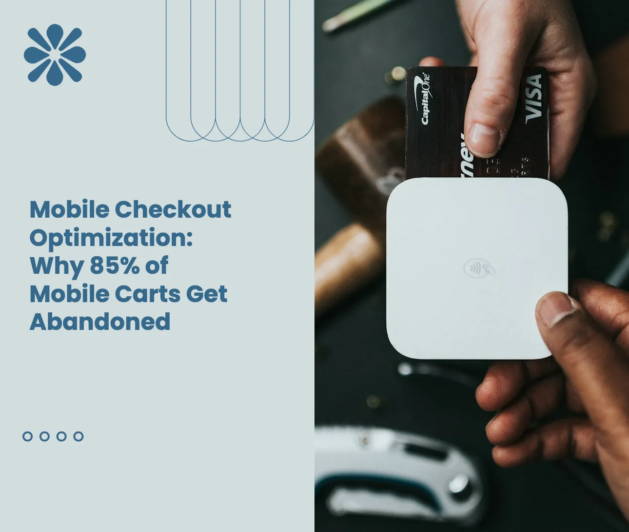
Open your Shopify analytics, filter to mobile, and look at your checkout completion rate. For most stores in 2026, the number is brutal: roughly 85% of mobile shoppers add items to a cart and then leave without buying. Desktop hovers around 70% — already painful — but mobile is in another category entirely.
That gap is not an accident, and it is not “mobile shoppers are different.” It is the predictable, measurable cost of running a checkout designed for desktop on devices where every pixel, every tap, every keystroke is harder. Mobile shoppers have less screen, slower thumbs, more distractions, weaker networks, and far less patience than their desktop counterparts. A checkout that feels merely cluttered on a 27-inch monitor feels actively hostile on a 6-inch screen.
The good news: mobile abandonment is not a fixed law of physics. It is a stack of fixable friction points — irrelevant payment methods, redundant form fields, shipping options that don’t apply, conditional logic that fires in the wrong order. Each one, on its own, looks small. Together, they’re the difference between a 15% mobile conversion rate and a 1.5% one.
This guide breaks down exactly why mobile carts fail at 85%, what the data says about each friction source, and how Shopify merchants are using conditional checkout rules — specifically Kedra Checkout Rules — to clean up the small-screen experience and recover the revenue.

The Real Numbers Behind Mobile Cart Abandonment in 2026
Before fixing anything, it helps to be precise about the size of the problem. Several data points worth committing to memory:
- Mobile cart abandonment runs around 85%, compared to roughly 70% on desktop, according to recent ecommerce research. That means on every 100 mobile carts, only 15 turn into orders.
- Mobile is now where the volume lives. Over 60–65% of ecommerce sessions happen on phones, so the abandonment gap matters disproportionately.
- The 2026 Baymard benchmark for cart abandonment across all devices sits at 70.22%, but mobile-only figures push 76–85% depending on the category.
- Unexpected costs cause around 47% of all abandonments, the single biggest driver — and shipping/tax surprises hit harder on mobile because the screen forces sequential reveal of new costs rather than at-a-glance review.
- Form fields punish mobile disproportionately. Research shows that every form field beyond eight reduces mobile checkout completion by another 4–6%.
In other words: mobile shoppers are reaching cart at the same intent level, but a far higher share of them never reach the thank-you page. The abandonment is happening inside the checkout, not before it.
Why Mobile Checkout Is Categorically Harder Than Desktop
The natural reaction is to make the desktop checkout “responsive” and call it done. That is what almost every Shopify theme already does — and it is not sufficient. Mobile checkout has structural disadvantages that responsive layouts cannot solve.
Smaller Screen, Sequential Information
On desktop, a customer can see cart contents, shipping options, payment methods, and order summary at a glance. On mobile, those elements stack vertically. Each tap reveals new information. Each surprise — a higher shipping rate, a tax line, an unfamiliar payment method — happens in isolation, with no context to absorb it. Surprises cause exits.
Typing on Glass
A desktop user filling out a 12-field form spends maybe 90 seconds. A mobile user on the same form spends 3+ minutes, hits autocorrect mistakes, retypes city names, and curses any field that doesn’t accept paste. Stripe’s research notes that autofill alone reduces mobile form completion time by 40–60% — and any form field that isn’t autofill-friendly is a tax on conversion.
Distracted Browsing
Mobile shoppers don’t sit at a desk and complete a transaction. They check out from couches, trains, lunch breaks, and bathrooms. Notifications interrupt them. A page that takes too long to load loses them to Instagram. Friction that would be acceptable in a focused desktop session becomes an exit on mobile.
Network Variability
A 4G/5G drop, a captive Wi-Fi portal, a tunnel — all real, all unpredictable. Mobile sessions get interrupted. If your checkout doesn’t preserve state, every interruption is a lost cart.
Tap Targets and Buttons
On mobile, a “Continue to payment” button placed too close to a “Cancel” link creates accidental exits. Express payment buttons (Apple Pay, Google Pay, Shop Pay) compete for prime above-the-fold real estate. Get the layout wrong and you lose customers who actually wanted to pay you.
These structural disadvantages compound. Each one costs a percentage point of conversion — and your mobile checkout is fighting all of them simultaneously.

The Top Friction Sources Killing Your Mobile Conversion
Drilling into the 85% abandonment number, a handful of specific friction sources do most of the damage. Fix these and your mobile conversion rate improves immediately.
1. Showing Payment Methods That Aren’t Relevant
Mobile shoppers see payment options as a vertical list. If you show all eight methods to everyone — credit card, PayPal, Klarna, Afterpay, Affirm, Amazon Pay, COD, bank transfer — you are forcing a small-screen user to scroll past five options that don’t apply to them.
The cost shows up two ways. First, decision fatigue: more options reduce conversion when most aren’t relevant. Second, accidental selections: a thumb tap on the wrong row sends the shopper down a flow they didn’t intend, and many never recover.
The fix is conditional display: show COD only to shoppers in COD-compatible regions, hide BNPL on cart values below the lender’s minimum, hide bank transfer for retail customers and reveal it only for tagged wholesale buyers. Each rule cleans one row out of the mobile list.
2. Showing Shipping Options the Customer Can’t Use
Same problem, different list. Express shipping displayed to a customer whose ZIP is outside the express network. Free shipping displayed when the cart is below threshold. Standard shipping displayed alongside same-day, even after the same-day cutoff has passed.
On desktop, irrelevant shipping options are a minor annoyance. On mobile, they’re noise that pushes the relevant option below the fold and forces extra scrolling. Conditional shipping rules — based on cart value, ZIP, weight, time of day, and product type — dramatically reduce the visual load.
3. Unexpected Costs Revealed Late
About 47% of abandonments come from unexpected extra costs like shipping, taxes, and fees. Mobile makes this worse because each cost shows up on its own scrolled-into-view line, with no full summary visible. The customer sees a $12 shipping line for the first time after entering an address — and bounces.
The fix is twofold: surface costs earlier (free-shipping threshold messaging, estimated taxes shown in the cart drawer), and use conditional checkout messaging to set expectations on heavy or international orders before the customer reaches checkout at all.
4. Excessive Form Fields
Eight fields is the rough mobile threshold. Beyond eight, completion drops 4–6% per field. Many Shopify checkouts ask for fields the merchant doesn’t actually use:
- Phone number, when the merchant doesn’t send SMS updates.
- Address Line 2, empty in 80%+ of orders.
- Separate first/last name, when one full-name field works.
- Company name, irrelevant for most retail orders.
- City and state, when both can be auto-derived from the postal code.
Removing or conditionally hiding unused fields is one of the highest-leverage optimizations available, and most Shopify stores have never audited it.
5. Heavy or Cart-Dependent Rules That Aren’t Conditional
A merchant selling both retail and wholesale, or both digital and physical, or both domestic and international, has fundamentally different checkout requirements per order type. Forcing a mobile customer through a single one-size-fits-all checkout means the experience is wrong for somebody at every transaction.
The right approach is conditional logic at the cart and customer level — show shipping forms only for physical products, hide international payment methods for domestic customers, surface wholesale-specific fields only for tagged accounts. This is exactly the territory Shopify’s checkout customization extensions (and apps built on top of them) were designed for.
6. Express Payment Buttons Without Strategy
Apple Pay and Google Pay should reduce friction. They convert mobile shoppers in seconds. But poor placement, conflicting buttons, or showing express payment for products that aren’t compatible (subscriptions, customizable items) creates the opposite effect.
Stripe’s own data shows Apple Pay alone delivers a 22.3% lift in conversion when implemented well. Implemented poorly — too low on the page, hidden behind toggles, missing entirely — it costs you that lift.
7. Multi-Step Checkouts Without State Preservation
Multi-step checkouts can outperform single-page on desktop, but on mobile they magnify the cost of any interruption. A customer who steps away mid-checkout and comes back to a reset form is a customer you’ve lost. Express payment buttons (which collapse the entire checkout into a single confirmation) are partly so effective on mobile because they sidestep this problem entirely.

Why Conditional Checkout Rules Move the Needle on Mobile
The thread connecting most of the friction sources above is relevance. Desktop has the screen real estate to hide irrelevant options in plain sight. Mobile does not. Every payment method, shipping option, form field, and message that doesn’t apply to the current shopper is taking visual budget away from the ones that do.
Conditional checkout rules are how merchants reclaim that budget. The rules logic looks like:
- If customer country is not in the COD region, then hide cash on delivery.
- If cart total is below $200, then hide Afterpay (which has a $200 minimum).
- If cart contains digital products only, then hide all shipping methods.
- If customer tag includes “wholesale”, then show “Net 30” payment terms; otherwise hide them.
- If ZIP code is outside express ZIPs, then hide same-day delivery.
- If order weight is over 50 lbs, then hide standard shipping; show freight only.
- If time of day is past 2pm local, then hide same-day delivery.
- If cart contains alcohol, then require age verification and restrict shipping methods.
Each rule, on its own, removes one row of irrelevant content from the small-screen experience. Across a typical Shopify checkout, you’re looking at 5–15 rules that together transform the mobile flow from “scroll-heavy and confusing” to “tap-once-and-done.”
The data on this is consistent: stores that move from a one-size-fits-all checkout to a conditional one report mobile conversion lifts of 8–25%, with the largest improvements coming on stores that previously had the most cluttered checkouts.
How Kedra Checkout Rules Fits Into the Mobile Strategy
Kedra Checkout Rules is a Shopify-native app built on Shopify Functions specifically to give merchants the conditional control their checkout needs — without touching code, without paying Shopify Plus prices, and without slowing the checkout down. For mobile optimization, it solves the friction sources above directly.
Hide and Reorder Payment Methods Based on Conditions
Set rules like “hide COD when shipping country isn’t India” or “hide Afterpay when cart is under $200” or “hide bank transfer unless customer tag is wholesale” — and the mobile payment list collapses to only the methods that actually apply to this shopper. Every removed row pulls the “Pay” button further up the page.
You can also reorder methods so the highest-converting option for this customer segment appears first. On mobile, the first payment method in the list gets disproportionately more taps than the second or third — putting your best option at the top is one of the simplest mobile wins available.
Hide and Customize Shipping Methods
Conditional shipping rules let you remove options the customer can’t use: hide express when ZIP is outside the network, hide same-day after the cutoff time, hide standard for hazmat or oversized products, hide all shipping methods for digital-only carts. The mobile shipping list shrinks to what actually delivers.
Cart-Value, Tag, and Product-Based Logic
Combine rules with AND/OR logic so they fire in the right combinations: “show free shipping ONLY when cart >= $75 AND customer is in US AND no oversized items.” This level of control is what separates a clean mobile checkout from a noisy one.
Per-Market and Per-Currency Customization
Use Shopify Markets in combination with Kedra rules so European customers see iDEAL, Bancontact, and Klarna; Latin American customers see local methods; North American customers see Shop Pay and Apple Pay first. The mobile experience gets localized without per-region storefronts.
Built on Shopify Functions for Performance
Because Kedra Checkout Rules runs natively on Shopify Functions, the rule evaluation happens server-side at checkout, with no JavaScript bloat slowing your page. On mobile, where every kilobyte and every millisecond costs conversion, this matters.
Free Plan to Start
Kedra Checkout Rules has a free tier so you can install, set up your first 3–5 rules, and measure the mobile impact before committing to a paid plan. Most merchants see a measurable lift inside a week of going live with their first conditional payment-hide rule.
A Practical Mobile Checkout Audit You Can Run This Week
If you want to translate everything above into action, here is a one-week audit any Shopify merchant can complete.
Day 1: Measure Your Mobile Baseline
Pull the last 30 days of Shopify analytics, segmented by device. Note your mobile conversion rate, mobile cart abandonment rate, mobile average order value, and the top 3 exit points in your funnel. These are your benchmark numbers.
Day 2: Inventory Your Checkout Friction
Open your store on a real phone (not desktop dev tools) and complete a full checkout for each major customer scenario: domestic retail, international, wholesale, digital-only, oversized. Count the form fields, count the payment methods shown, count the shipping options shown, count the tap-to-completion. Note any surprises.
Day 3: Identify Irrelevant Options
For each customer scenario, list every payment method, shipping method, and form field that did not apply. These are your candidate cuts.
Day 4: Define Your Conditional Rules
Translate the candidate cuts into conditional rules. “Hide COD if country != IN,” “Hide Afterpay if cart total < $200,” “Hide express if ZIP not in [list],” and so on. Aim for 5–10 rules to start.
Day 5: Implement With Kedra Checkout Rules
Install Kedra Checkout Rules on the free plan, configure your first batch of rules through the UI, and test each rule on a real device before going live.
Day 6: Test on Real Devices
Re-run the Day 2 audit. Verify that each rule fires correctly across iOS Safari, Chrome on Android, and the Shop app. Check edge cases — empty cart, single-item cart, cart at threshold values, cart with mixed product types.
Day 7: Monitor and Iterate
Compare day-over-day mobile conversion against your baseline. Most improvements show up within 48 hours of going live. Identify which rules drove the biggest lift, then look for the next batch.
A week of focused work on conditional rules typically delivers a measurable lift in mobile conversion — and unlike most CRO experiments, conditional cleanup compounds with every other improvement you make to your checkout.
The Mobile Checkout Mindset Shift
The deepest reason most Shopify merchants under-invest in mobile checkout is mental, not technical. They look at the desktop experience, see something clean and functional, and assume mobile is “the same thing, smaller.” It is not.
Mobile is a fundamentally different channel with a fundamentally different shopper. The information density, the input method, the attention span, and the network conditions all change the rules. A checkout designed to work on desktop and then squeezed onto a phone is not a mobile-optimized checkout. A checkout designed mobile-first — with conditional logic that strips it down to only what this shopper, on this cart, in this country, at this time of day actually needs — is.
Conditional checkout rules are how merchants make that shift without rebuilding their store. The 85% mobile abandonment rate is not destiny. It is a tax you stop paying the day you start treating mobile as its own design problem.
If you want to start cleaning up your mobile flow this week, Kedra Checkout Rules is the lowest-friction path: install on the free plan, set up your first 5 conditional rules, watch the mobile conversion rate move within days. The shoppers who are silently bouncing right now are the same shoppers who will buy when the friction is gone.
Sources:
- Cart Abandonment Statistics 2026 — Upsella
- 5 Ways to Stop Cart Abandonment and Increase Mobile Conversions — Tapcart
- Mobile Checkout Optimization: 32 Proven Fixes — Convertcart
- Mobile Checkout Best Practices for Ecommerce Businesses — Stripe
- Top Reasons For Cart Abandonment — Primer
- Checkout Optimization Best Practices for 2026 — BigCommerce
- The Evolution of Checkout Customization — Intelligems
Kedra Team
Expert insights on Shopify development and e-commerce growth strategies.